


The newly launched annual publication “4B” of the Künstlerhaus Stuttgart is intended to show and convey the multifaceted nature of the Künstlerhaus to members and other interested parties in an analogous manner. The 100-page book deals primarily with artistic formats that took place outside the curated exhibition program. Divided into 8 chapters, the publication guides thematically through the year 2022 of the Künstlerhaus Stuttgart. From smaller workshops to exhibitions and farewells, it was tried to show as much information as possible.
The transparent way of acting of the Künstlerhaus became the leitmotif in the layout of the publication. On the cover, a table of contents shows the textual content, on the back cover all images appearing in the publication are shown as an index, and on the spine of the book is the imprint. A modular grid makes it possible to design the various contents differently in order to point out their independence. In addition, the images are given different white spaces through their displacing placement, thus changing the surrounding text. In this way, it was possible to give each page a unique appearance. With Matter Of, Offset print, Open spine, 180×260mm

The “Forum kritischer Wissenschaften” is a cross-status and cross-departmental association that works to perpetuate critical research and teaching at the University of Frankfurt and to promote student initiatives. A collective poster was created for their most current event, featuring three book launches of various kinds. Abstract book forms and interlocking shapes were used to convey its complexity. With Matter Of, Digital print on billboard paper, 594×841mm (A1)


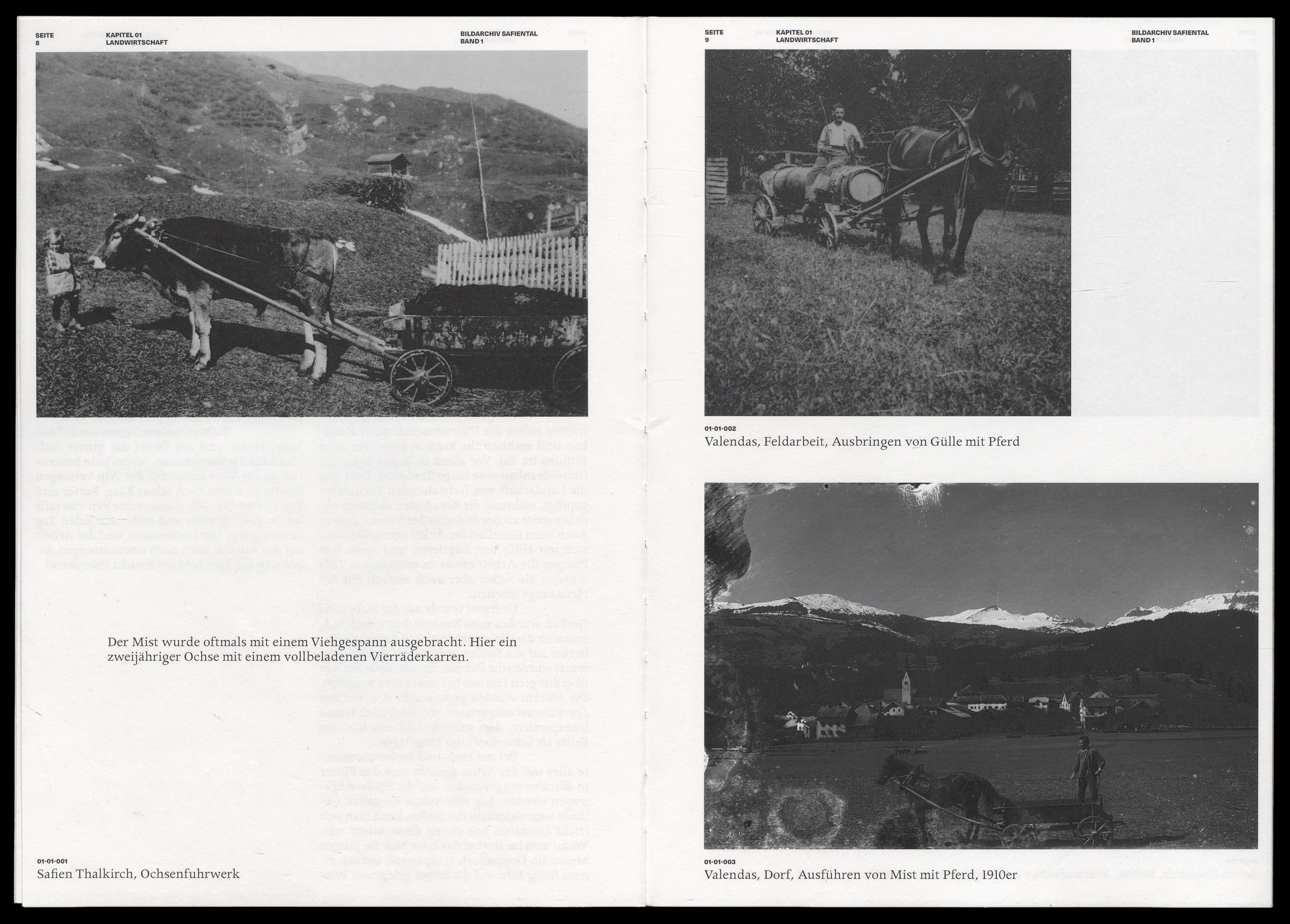
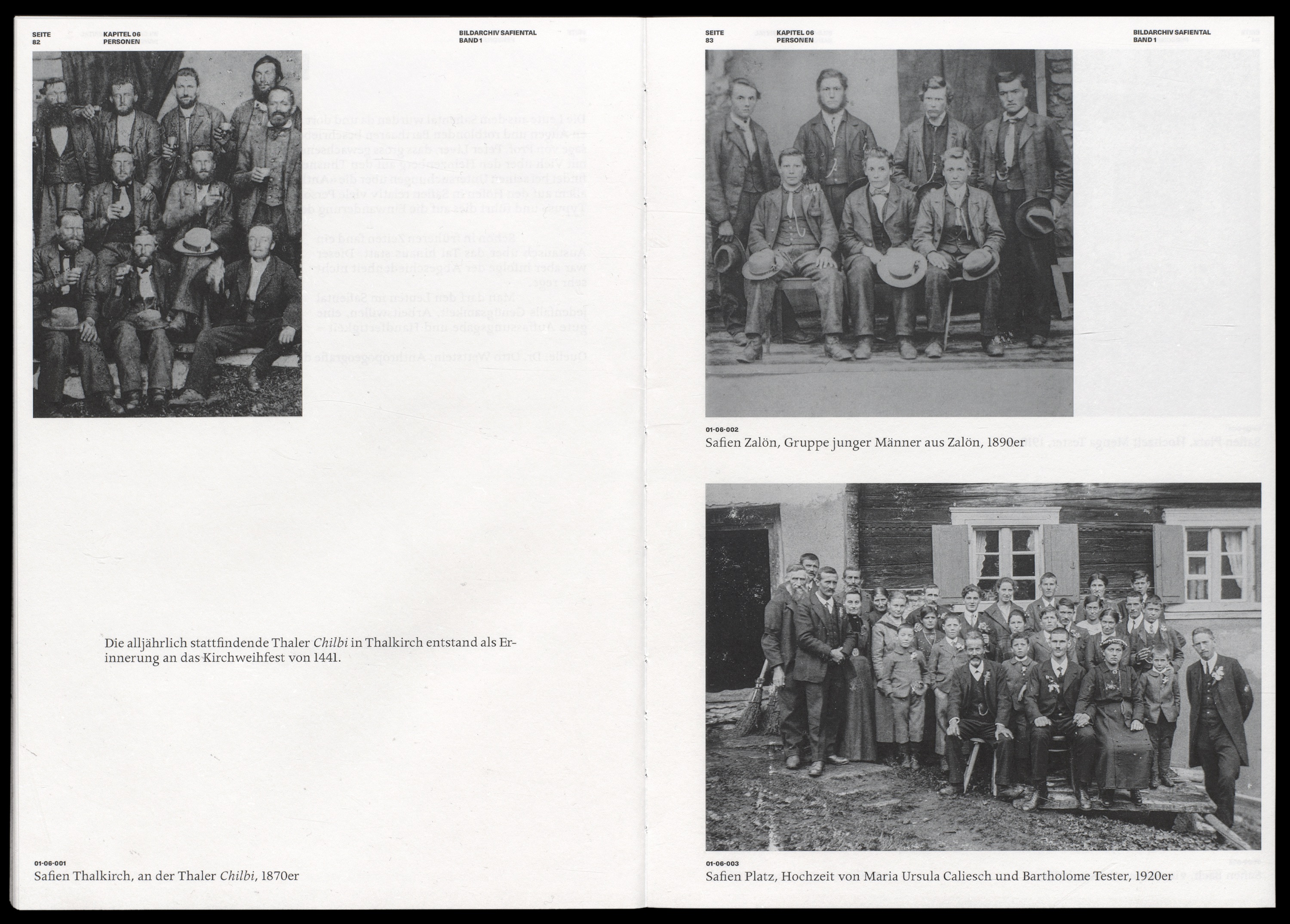
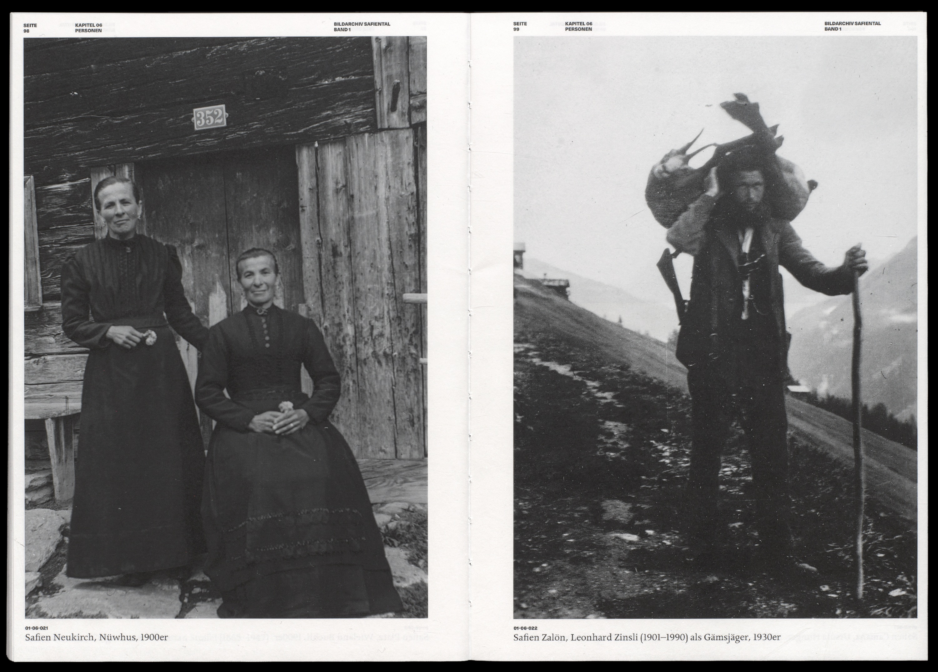
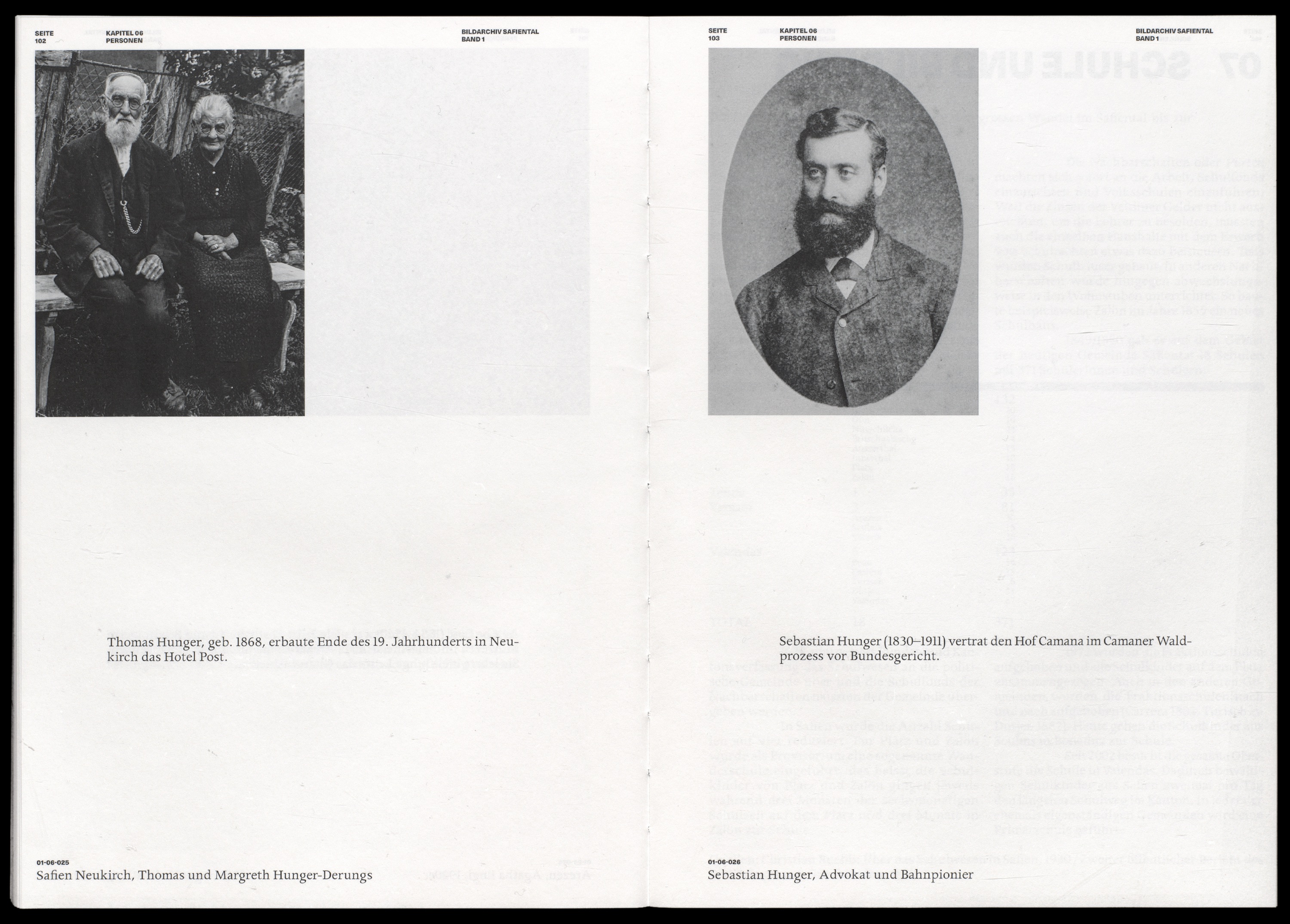

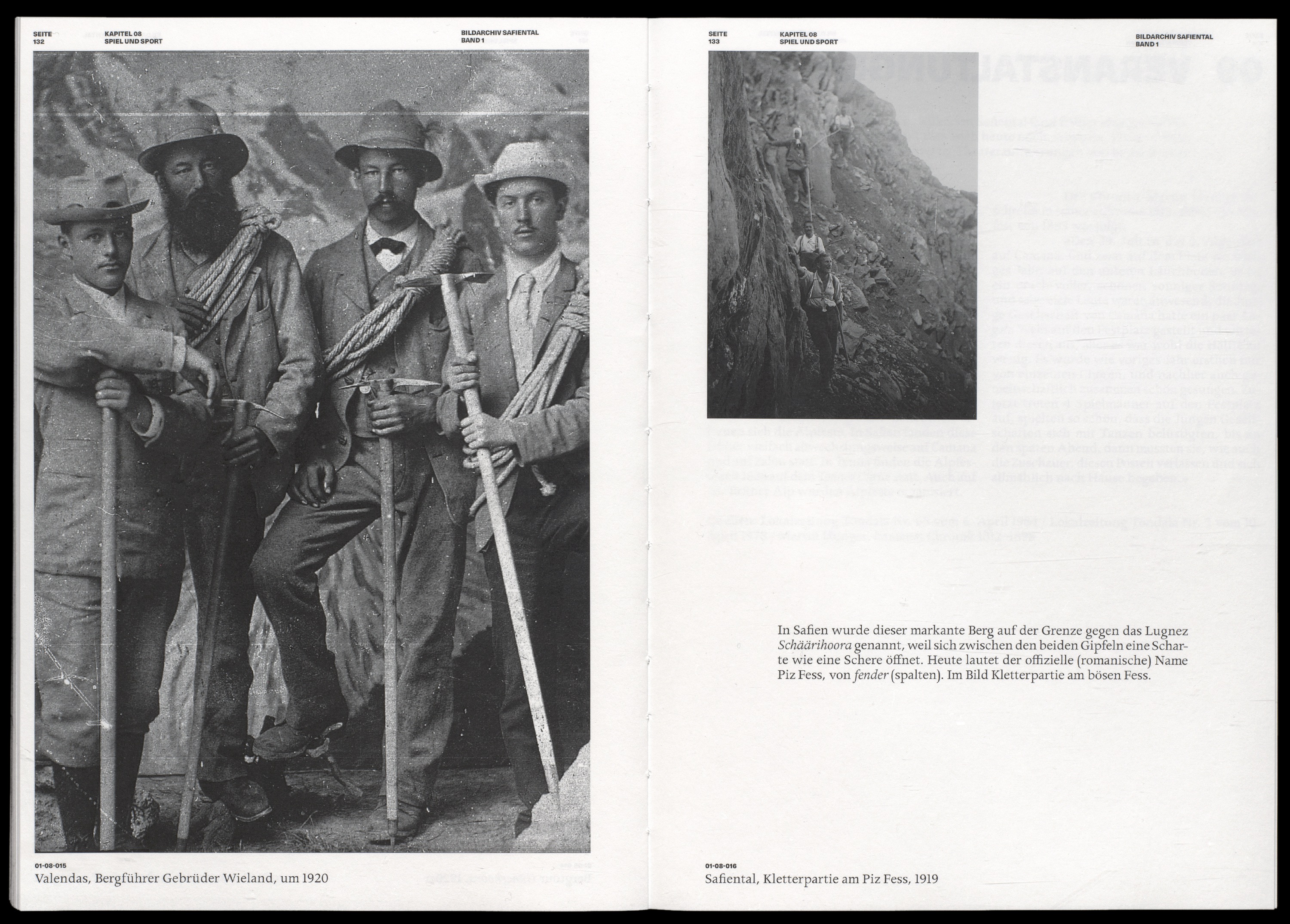
The aim of the “Bildarchiv Safiental” project is to preserve and describe the Safiental picture collections for future generations and to make them easily accessible. Thus, glass plate negatives, framed paper prints and family albums from private parlors as well as picture collections of researchers come together in the picture archive. The result of the collection of the Bildarchiv Safiental” is a book divided into two volumes with 15 thematic chapters. At the end of each volume an index gives further information about the photographs. This information was written by the Safier Mattli Hunger, who has spent his life in the valley and has an immense knowledge of it. In these descriptions there are – often for foreigners – dialect terms that are difficult to understand, which are further explained in a glossary.
Visually-conceptually, the volumes are oriented to an album, where the images are presented present and in large format. As is also known from family albums, intermediate information can be read for particular pictures, which loosens up the picture book and thus generates a new rhythm. The two volumes were printed on uncoated paper and bound with an open spine binding to achieve a handmade and natural look. For Fotostiftung Graubünden, Digital print, Open spine with black thread, 297x210mm (A4)


Corporate design and landing page for the Chur-based company Locomot GmbH. Locomot develops tools for small and medium-sized memory institutions. The logo is to combine technology and aesthetics by means of an abstract abbreviation. Thus, sub-companies and programs can be continued with the system of the logo to create a unified range.


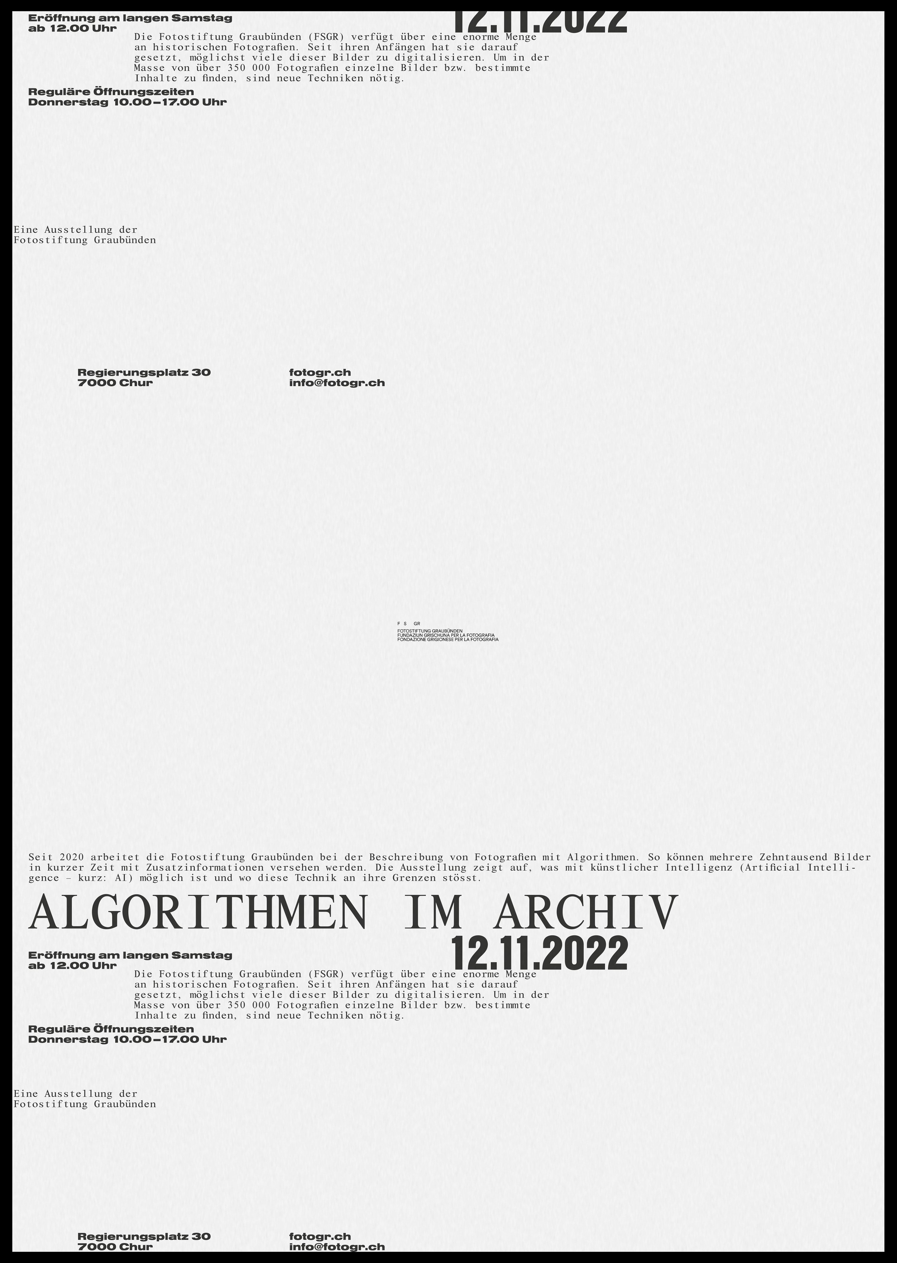
The Fotostiftung Graubünden (FSGR) has an enormous amount of historical photographs. In order to find individual images, or specific content, in the mass of over 350 000 photographs, the FSGR has been relying on machine learning since 2020. The exhibition “Algorithms in the Archive” shows what is possible with artificial intelligence in relation to an image archive. This exhibition opened as part of the “Langer Samstag” in Chur. In the exhibition itself, among other things, the automatic keyword assignment, “Similarity Search”, automated coloring, as well as the training and errors of artificial intelligence were thematized and visually demonstrated.
An overall concept for an exhibition with key visual, poster and an info booklet was created. The design basis was the learning and simultaneously reproducing artificial intelligence. Thus, on the keyvisual poster, the information is shown repeatedly, as if on a tape. Since the exhibition was mainly about images, the design did without them. A monospace font combined with Helvetica in different cuts, nested formats and unusual indents thus embody the AI and its decisions.

The Fotostiftung Graubünden (FSGR) has an enormous amount of historical photographs. In order to find individual images, or specific content, in the mass of over 350 000 photographs, the FSGR has been relying on machine learning since 2020. The exhibition “Algorithms in the Archive” shows what is possible with artificial intelligence in relation to an image archive. This exhibition opened as part of the “Langer Samstag” in Chur. In the exhibition itself, among other things, the automatic keyword assignment, “Similarity Search”, automated coloring, as well as the training and errors of artificial intelligence were thematized and visually demonstrated.
An overall concept for an exhibition with key visual, poster and an info booklet was created. The design basis was the learning and simultaneously reproducing artificial intelligence. Thus, on the keyvisual poster, the information is shown repeatedly, as if on a tape. Since the exhibition was mainly about images, the design did without them. A monospace font combined with Helvetica in different cuts, nested formats and unusual indents thus embody the AI and its decisions. Digital print, 594x841mm (A1)
The Fotostiftung Graubünden (FSGR) has an enormous amount of historical photographs. In order to find individual images, or specific content, in the mass of over 350 000 photographs, the FSGR has been relying on machine learning since 2020. The exhibition “Algorithms in the Archive” shows what is possible with artificial intelligence in relation to an image archive. This exhibition opened as part of the “Langer Samstag” in Chur. In the exhibition itself, among other things, the automatic keyword assignment, “Similarity Search”, automated coloring, as well as the training and errors of artificial intelligence were thematized and visually demonstrated.
An overall concept for an exhibition with key visual, poster and an info booklet was created. The design basis was the learning and simultaneously reproducing artificial intelligence. Thus, on the keyvisual poster, the information is shown repeatedly, as if on a tape. Since the exhibition was mainly about images, the design did without them. A monospace font combined with Helvetica in different cuts, nested formats and unusual indents thus embody the AI and its decisions. Digital print, stapled, 210×148mm (A5)


Trenches and differences of various kinds characterize the image of Switzerland. These ideologically charged clichés still dominate our image of society today. Swiss people have long been accustomed to a culture of distinction. This is also evident in the so-called urban–rural divide. This research resulted in an approximately 200-page editorial that manifests my argument against a divide between urban and rural areas. The publication is divided into 3 chapters, an introduction, main body and appendix. This didactic structure, as well as the argument for denying the trench, is disrupted by inlays that adhere to the concept of the trench. The design basis was the aesthetics of map works with the strict grid, scales and sans serif font. As a contrast to the simple grotesque, the Bagnard was used as a title, quotation and explanatory font. In addition to the standard four CMYK printing colours, a white overprint symbolised the filling of space and thus the filling of the trench. This publication was created during my diploma semester. Digital print, Swiss brochure, 180×260mm

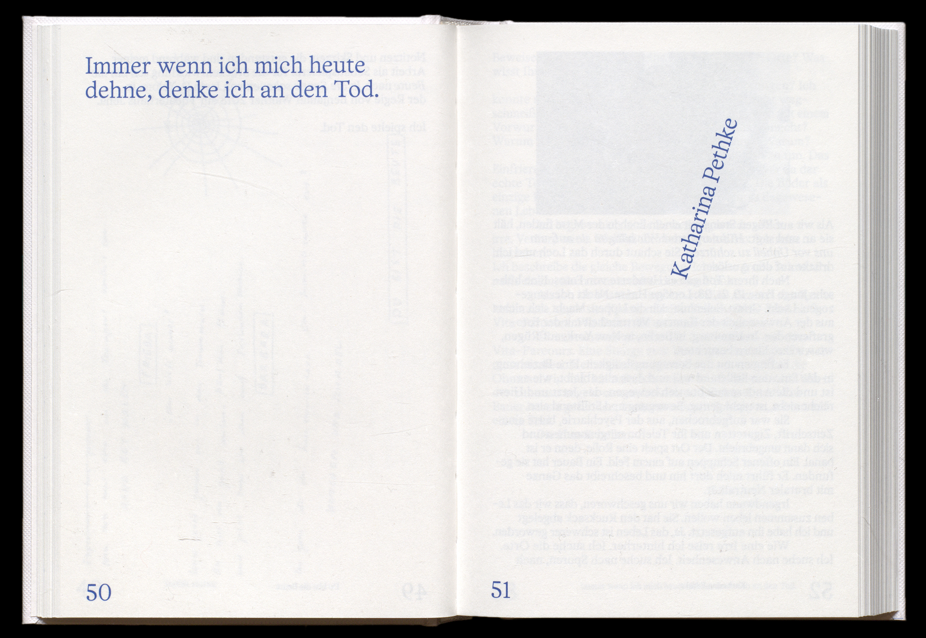


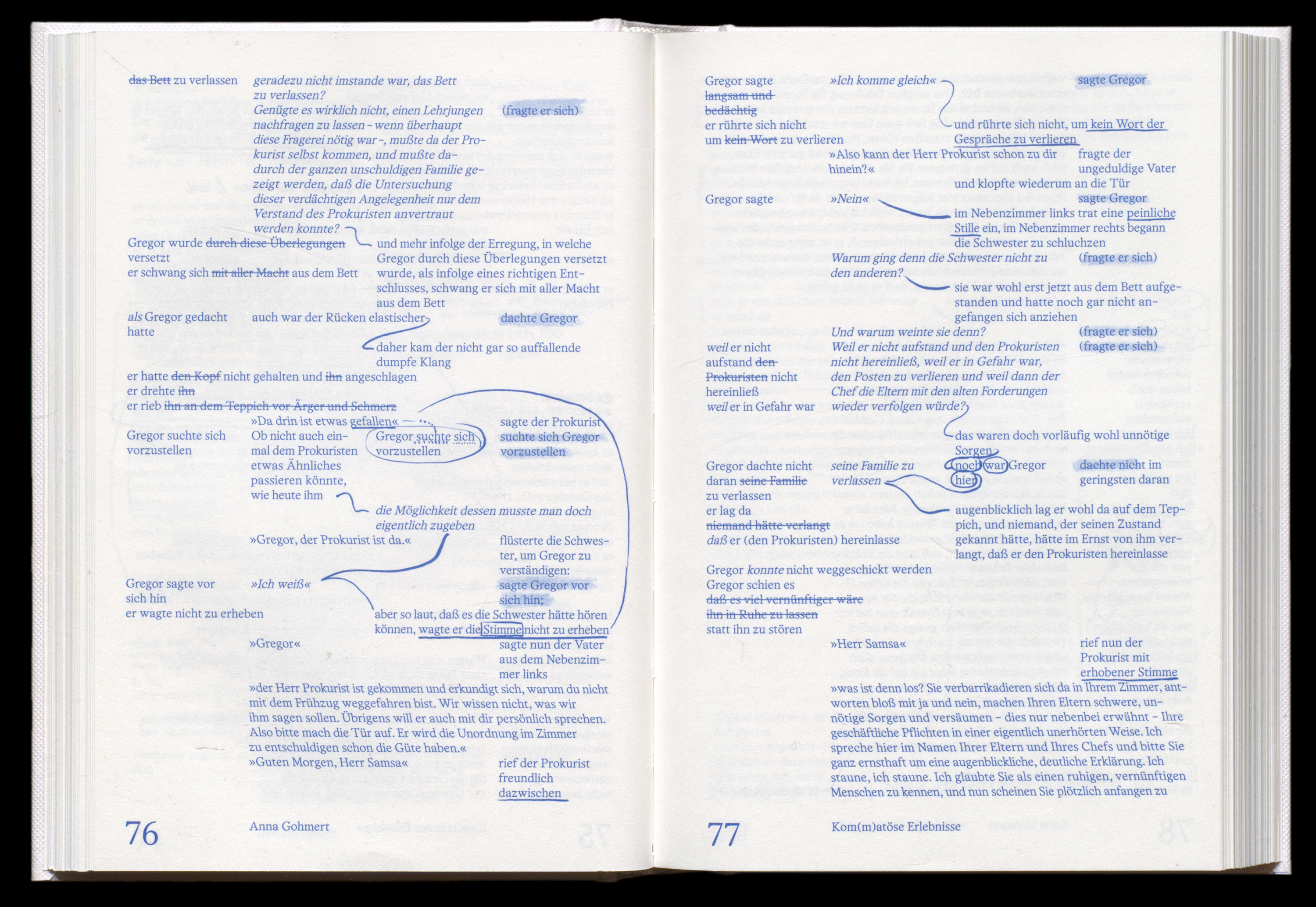


“Sterben Üben” is the title of the book by the German artist Anna Gohmert, who, in collaboration with ten other artists, has created a collection on the subject of finitude. It is about the acceptance and non-acceptance of impending death and about perspectives that are presented in scientific and poetic form. The aim of the publication was to break the theme of death and the still prevailing taboo about it. The book is meant to convey intimacy, familiarity and at the same time a certain seriousness. The format of the book, the choice of font, colouring and arrangement of the text were chosen to support this impression. This project was created during my internship at Matter Of. Offset print, 180×125mm (The book “Sterben Üben” was nominated for “Die Schönsten Deutschen Bücher” and is shortlisted.)
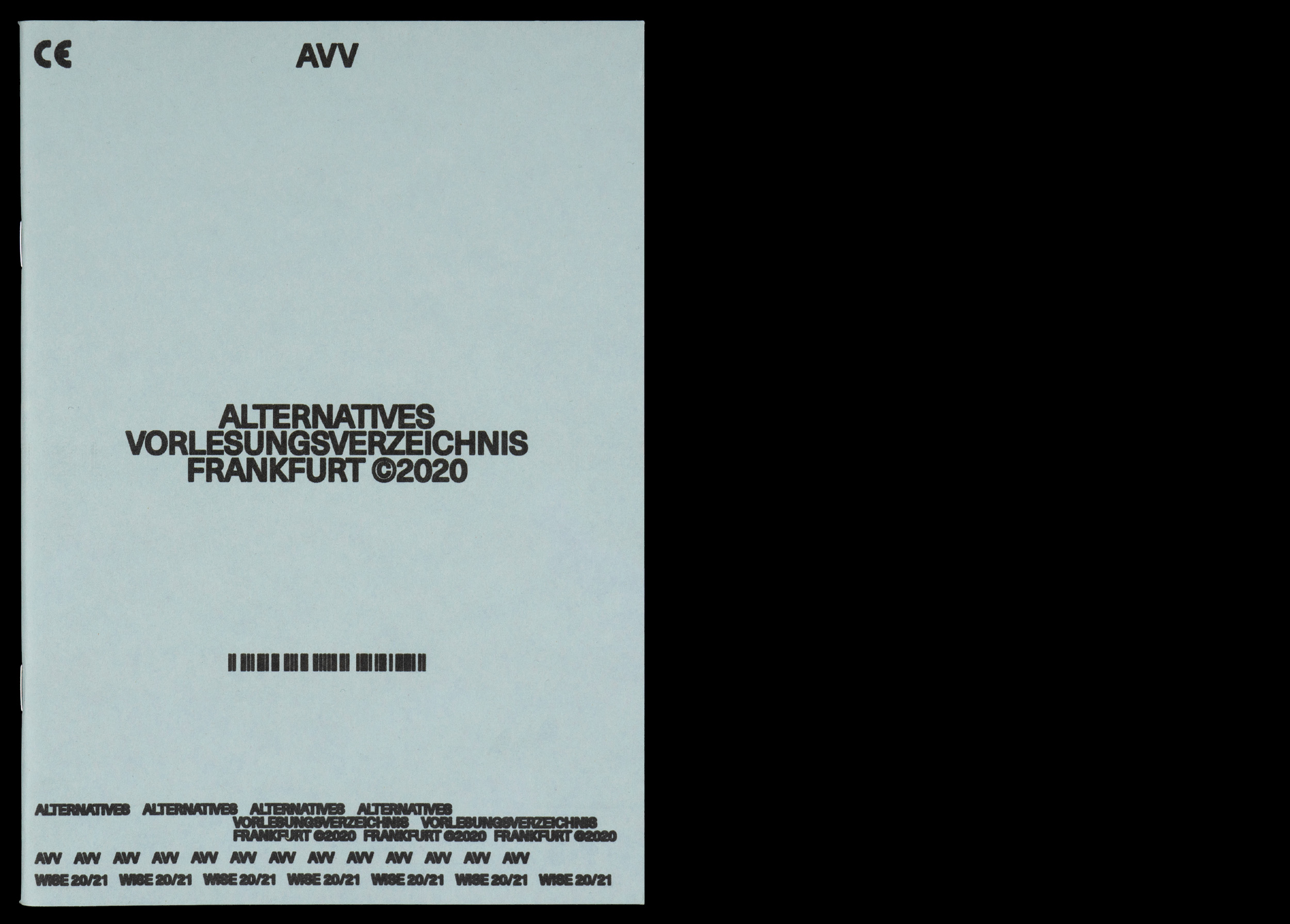


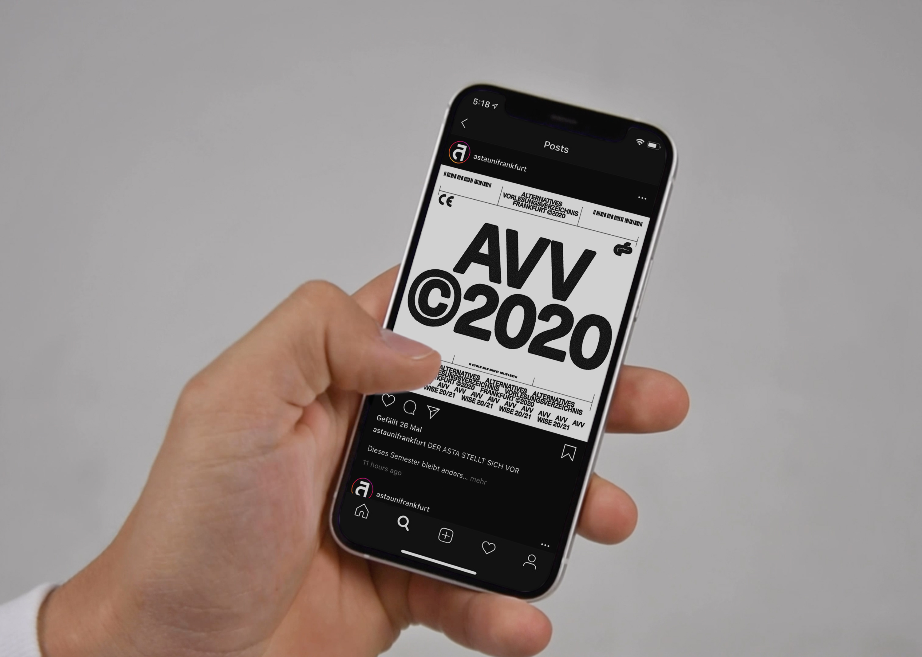
The “Alternative Vorlesungsverzeichnis” is a directory of autonomous tutorials and student events and reading groups at Goethe University in Frankfurt. It is managed and also held by students. I found the divergence between the university’s almost exclusively scientific courses and the analogue craft very exciting. I was inspired by sandpaper to pick up on this very divergence. I also questioned the hierarchies of information. Important dates, times and connections were therefore given the most weight and thus determine the design of the respective pages. Through this shift, one begins to perceive information differently. In addition to the printed booklet, a folding poster was created in the same visual style, which presents all lectures in a condensed form and was distributed together with the booklet. The social media presence concluded this project. This project was created during my internship at Matter Of. Offset print, 148×210mm (A5) & Digital print, 420×594mm (A2)


Based on the project “Kunst im öffentlichen Raum in Stuttgart”, an art print was realised. As a catalogue raisonné as complete as possible, it documents all art in public space in Stuttgart for the first time and presents it in an accessible way to counteract its disappearance. More topical than ever, the contemporary presentation encourages a new and conscious approach to the works as well as to the public urban space. The book contains 435 works of art by almost 230 artists. As a supplement to the book, this art print was published, which also contains all the artworks. This project was created during my internship at Matter Of in Stuttgart. Offset print on poster paper, 841x1189mm (A0)


Since the advent of photography, the diversity and uniqueness of the canton of Graubünden has always fascinated professional and amateur photographers from near and far. A unique photographic heritage has emerged that must be safeguarded for the future and processed for dissemination in the present day. This is the task of the Fotostiftung Graubünden, which was established in spring 2014. In order to be able to convey its importance to the outside world, a new image was created for the FSGR. The new, simple word logo refers to the multilingualism of the canton and conveys clarity and structure.


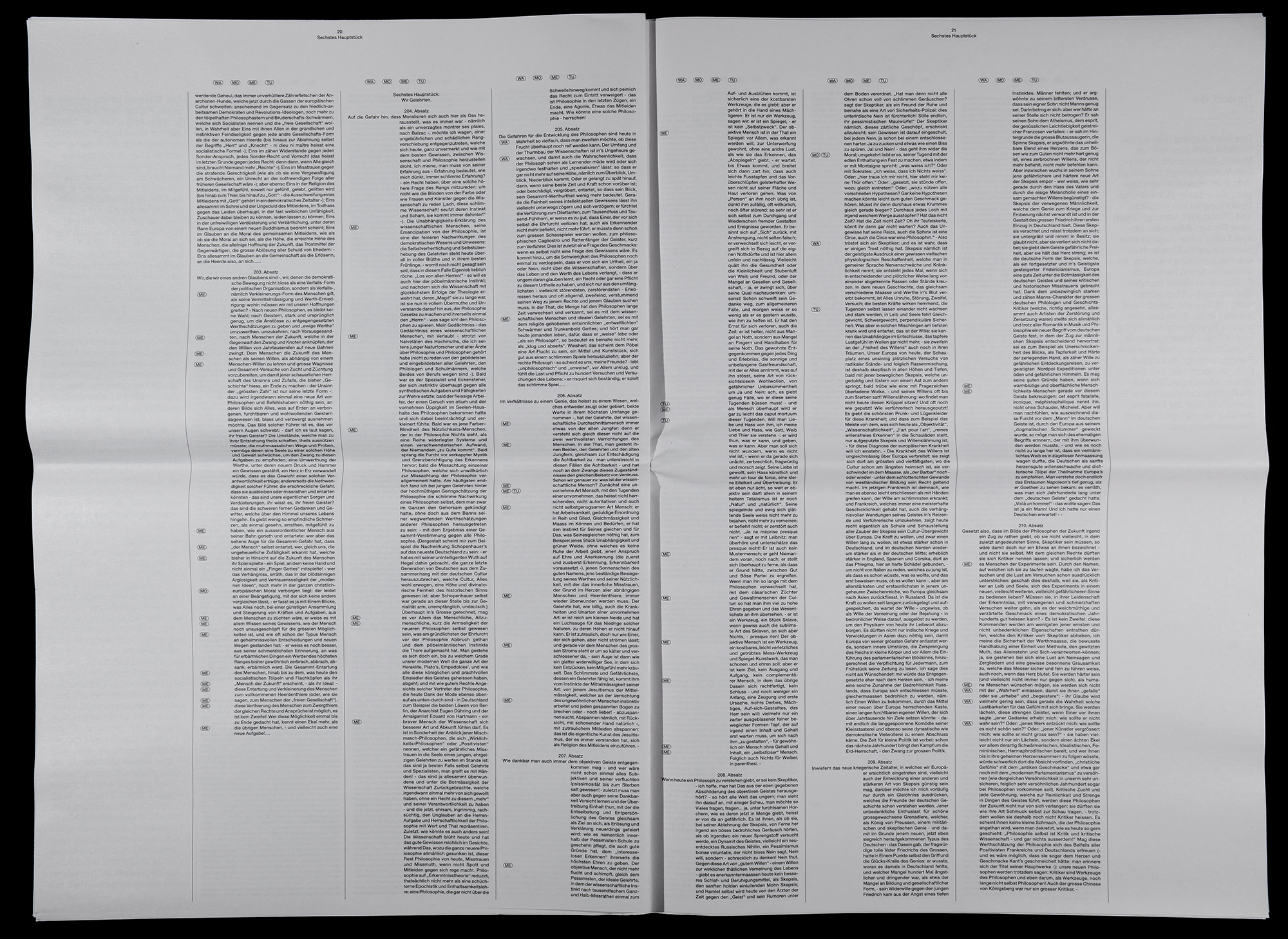


In the literary work “Jenseits von Gut und Böse” by Friedrich Nietzsche, moral issues are treated and reproduced in a grotesque manner. The work is divided into 296 more or less long text paragraphs, which independently deal with different moral values. To make it easier for the reader to consume the book, the paragraphs are divided into different sections of the book by means of indents. In this way, one gets a rough overview of the text structure more quickly. In addition, explanations of terms, explanations and customer reviews are included in the newspaper. Digital print on newspaper, 327×480mm (Rheinisches Format/Leipziger Zeitung)
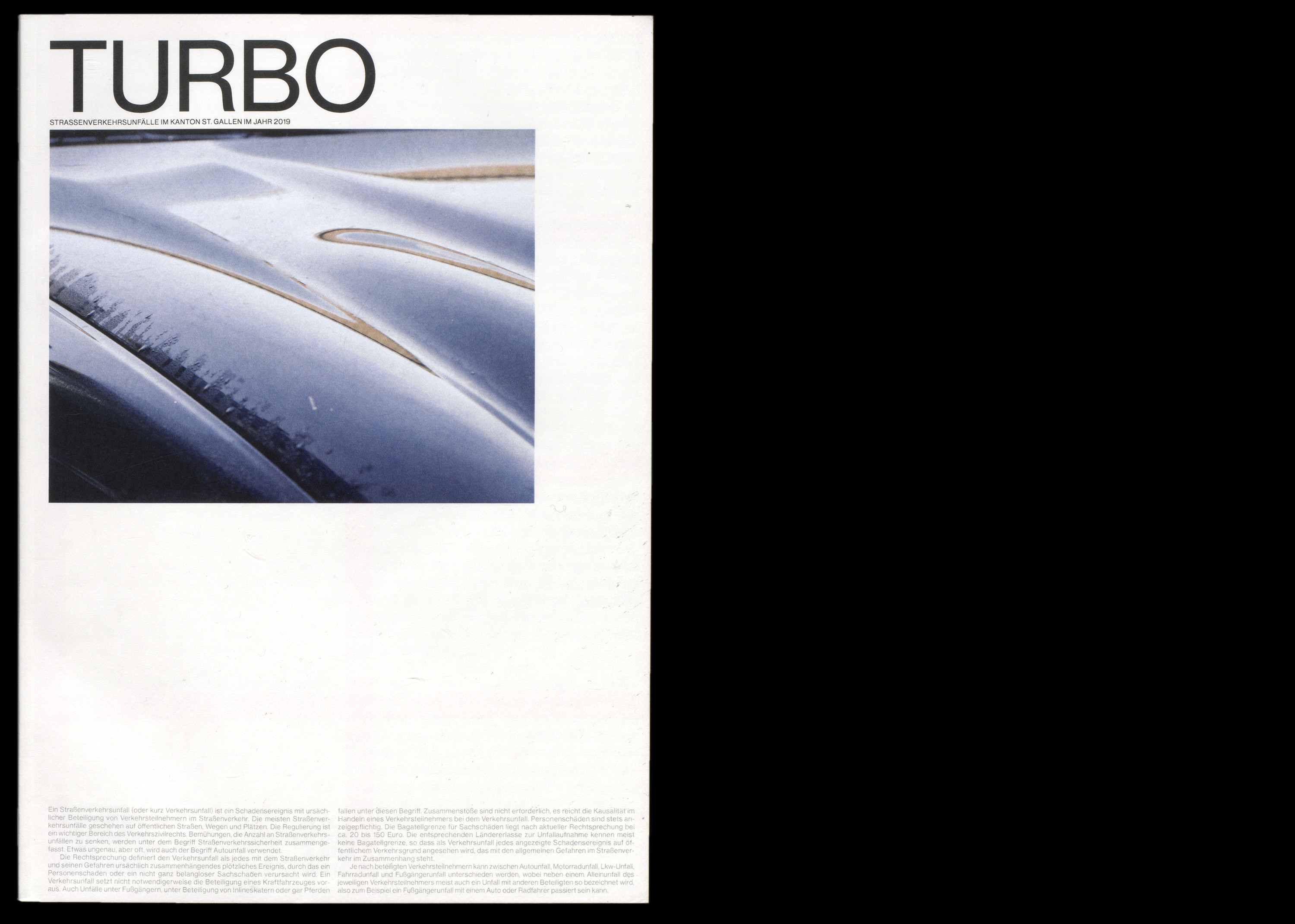
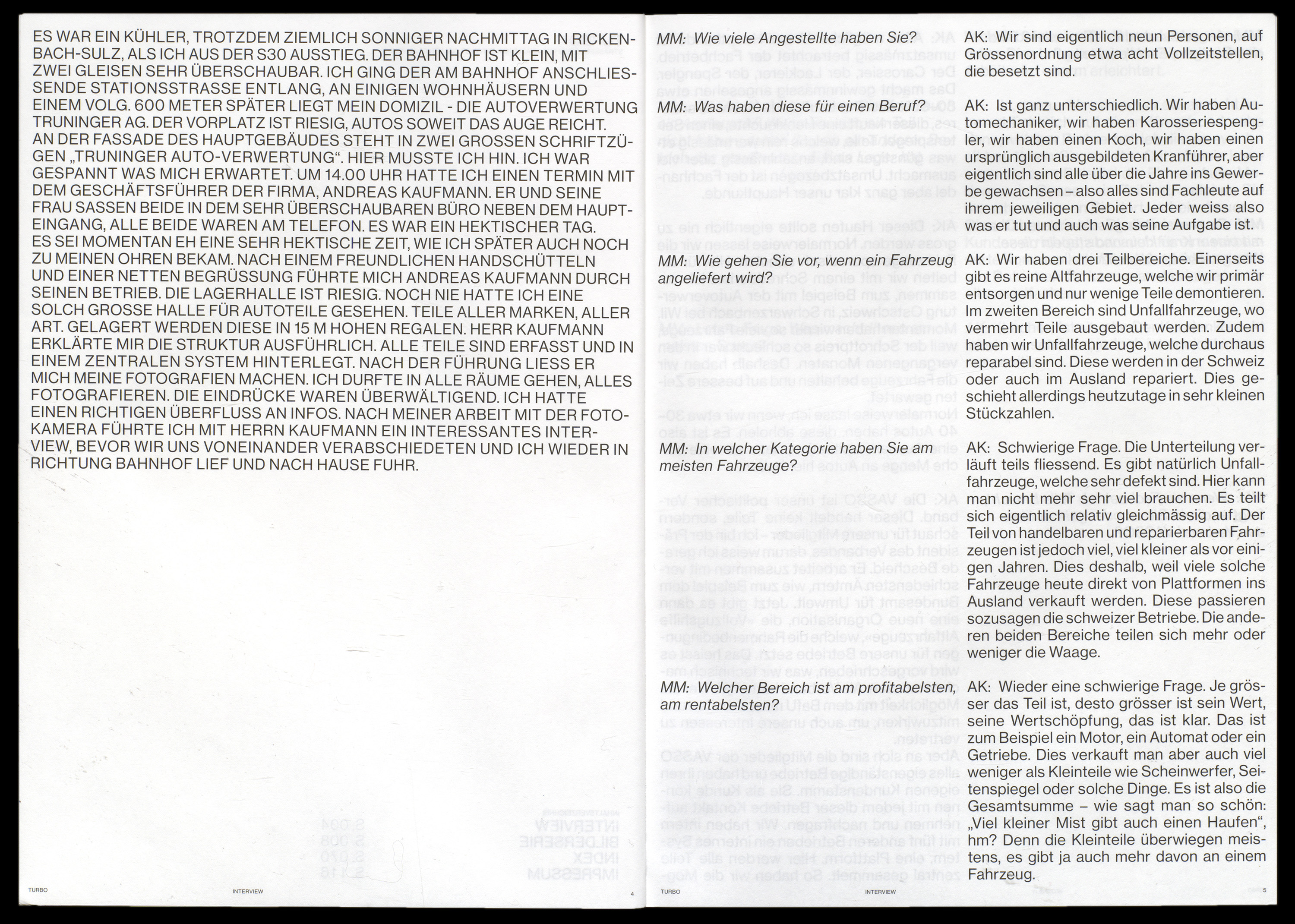
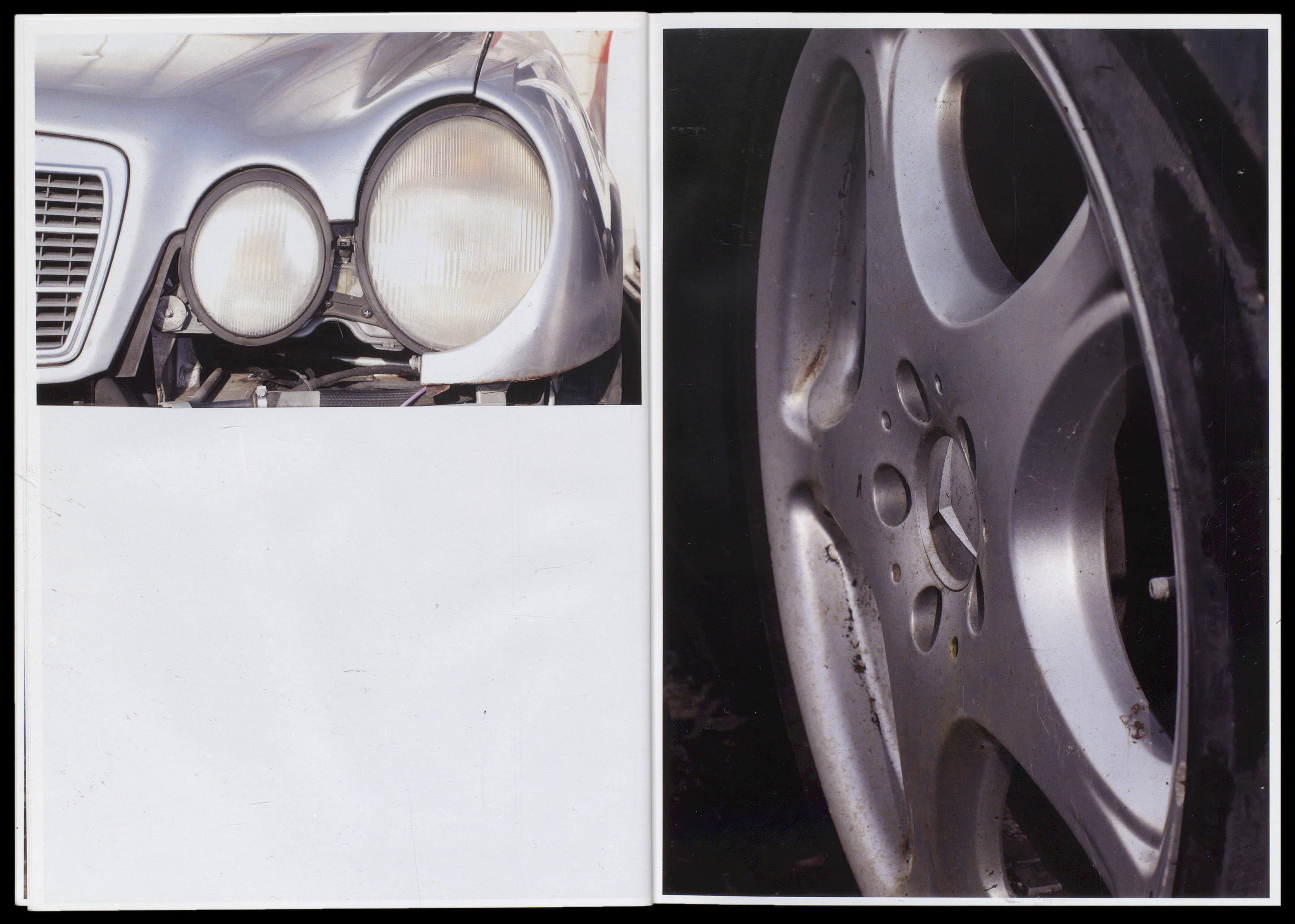
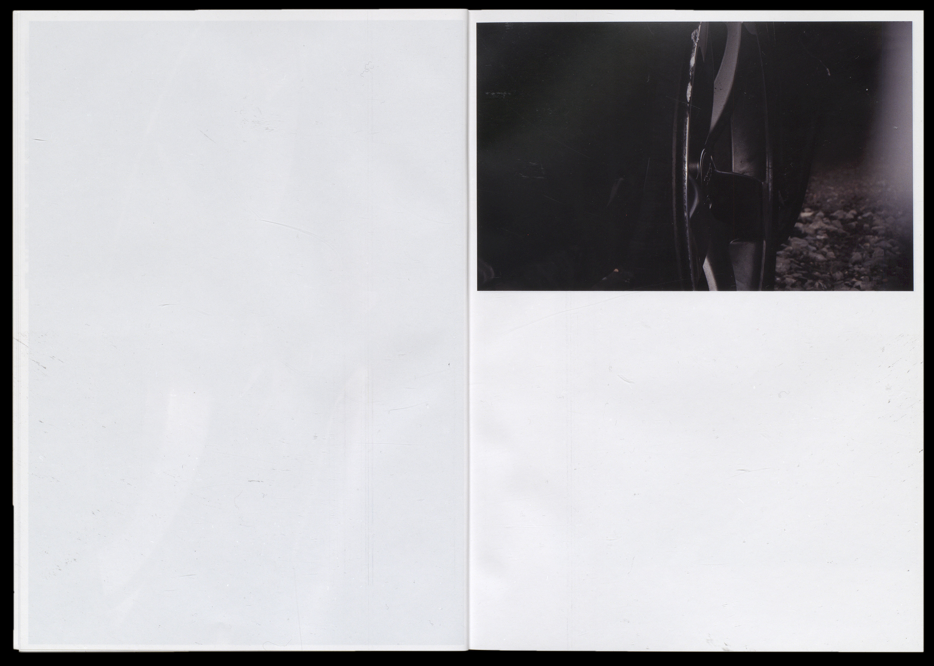


The publication “Turbo” deals with vehicle accidents and shows photographic details of crashed vehicles, which in themselves bring an aesthetic form with them. The connection between the violence of a crash and the resulting aesthetics is thus presented in a cynically-critical way. An interview with a manager of a scrap yard and an index of all accidents in the canton of St. Gallen in 2019 provide a textual contribution to the theme. Digital print, 275×195mm

The Creative Week is organised annually by the Art Directors Club Switzerland at the Toni Areal. Speakers from all areas of the creative industry, such as Hermann Vaske or Tom Hidvegi. This year’s motto of the Creative Week was “The Creative Take-over”. It must be added that the week could not be held in March because of the Corona pandemic. It has currently been postponed indefinitely. The concept, which is based on the motto of the Creative Week, refers to taking over territory. Therefore, it was decided to take the aesthetics of flags and reinterpret them. Kandinsky’s work “Punkt und Linie zu Fläche” served as the basis for the redesign of flags. Thus the parameters were these three basic forms of design. Through a modular system defined by parameters of the speakers, it was possible to design a flag for each one. The colouring of the flags was based on the work of the respective persons. The keyvisual was limited to only one parameter, the semicircles. Thus, the key visual is shown as a part of the whole. The Creative Week was organised in cooperation with Noam Benatar, Daryl Schiltknecht & Katharina Shafiei-Nasab.


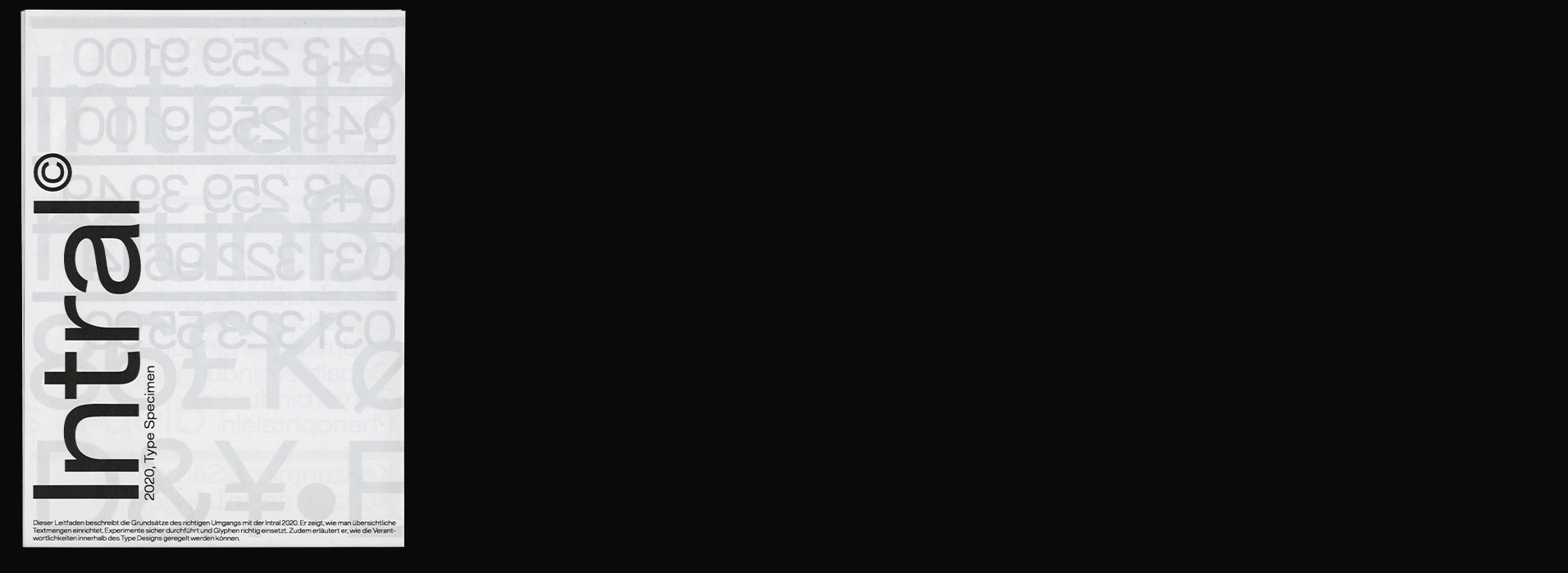
The requirements for the “Intral” typeface were precisely defined in advance. It is to be modelled on the original Grotesk, but distinguished by a discreet extended character. Nevertheless, it should be clearly universal and usable in any size – for bulk texts and also for headlines. The very sterile and restrained style was taken up again in the type specimen in order to represent these characteristics in an adequate form. The specimen was designed based on a package insert, which was intended to show the characteristics of the typeface. The majority of the text consists of a guideline from the Zurich Cantonal Laboratory, which describes the safe handling of chemicals in primary schools. This typeface was created in collaboration with Daryl Schiltknecht.

The Langnau Jazz Nights have attracted jazz musicians from all over the world with their international format. This year they celebrate their 30th anniversary. For this, the Langnau Jazz Nights committee announced a competition to design the performance for the event. In my proposal, the keywords “Langnau Jazz Nights” were put into a shape reminiscent of an ellipse. Through a swirl, a kind of pull was depicted, which jazz music also has on its listeners. Through additional processing, the writing was made somewhat blurred to suggest movement. In this way, the arrangement can also be linked to the reverberation from loudspeakers. The typographic layer with the various information about the event was designed in a classic and unobtrusive way. This leaves the graphic representation of the ellipse as the main focus. Ink-jet on blueback paper, 594×841mm (A1)
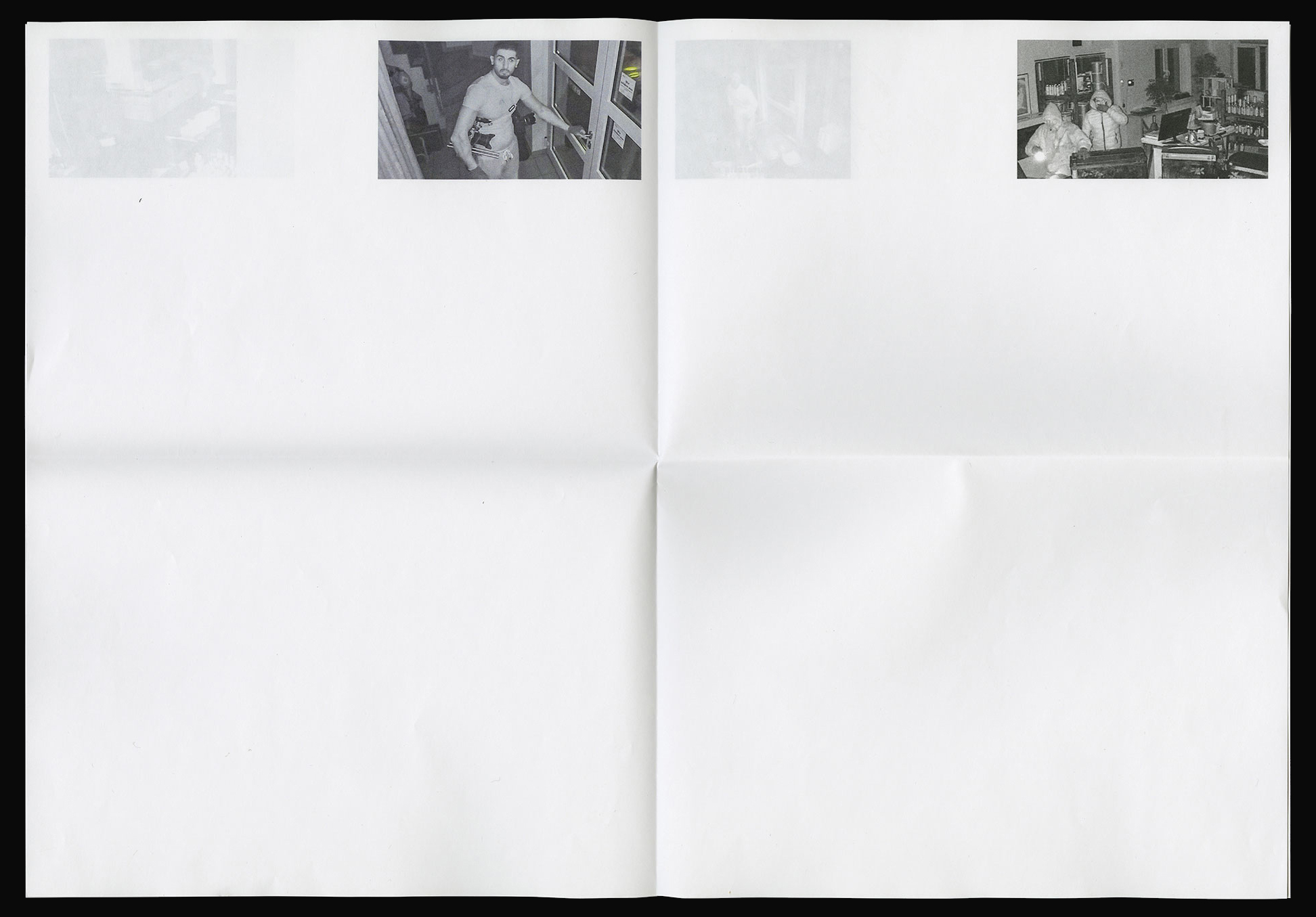


On 8 November 2000, the Migros Kulturbüro in Zurich was broken into. For this, an editorial in the style of a newspaper was designed, reflecting the break-in. In collaboration with Bastien Egger, Samara Keller, Gregor Maria Sahl & Daryl Schiltknecht. Laser printing on paper, 200×280mm

The Filmpodium Zürich is a cultural organisation that has posters designed by the ZHdK on various film themes. In this proposal, Buñuel’s initials were abstracted and combined with his portrait. In collaboration with Daryl Schiltknecht. Ink-jet on blueback paper, 594×841mm (A1)


“FUBU”, short for “For Us By Us”, is a series of readings organised by students of Visual Communication. About every month they invite graphic artists, designers, studios, etc... For the first event of the new semester 19/20, Studio Bureau came by to present their projects. In collaboration with Christian Knöpfel, Samara Keller & Vilté Jurgutyté. Ink-jet on blueback paper, 895×1280mm (F4)


Sneakerness is an event for sneaker fans. It took place in 2019 in Zurich, Oerlikon in Hall 622. In the Visual Communication department, a competition was announced to design a poster on the theme of sneakers. These days, the sneaker is a ubiquitous consumer good that is considered a status symbol. The hype around the trainer is shown by means of this poster. The most expensive offers of shoes with their prices are illustrated in the form of tables on the Ebay platform. The change into the immeasurable, the decadent is interesting. In collaboration with Daryl Schiltknecht. UV direct print on aluminium composite panel, 895×1280mm (F4)

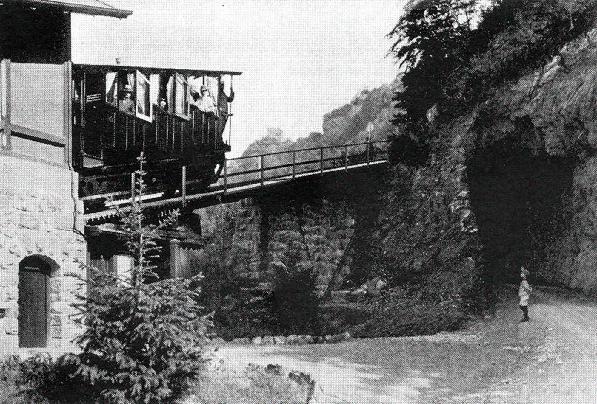
The Wartensteinbahn was a historic water ballast railway from Bad Ragaz to Pfäfers in Switzerland, which is to be rebuilt 60 years after it ceased operation. To initiate the project, a new visual identity was created in the form of a logo. In addition, a flyer was sent out to appeal for donations. Digital print on paper, 420×297mm (A3)


The publication “Techniken des Einfalls und der Niederschrift” is a text by Sandro Zanetti and deals with the concepts and writing practices of three Dadaists. This text formed the basis of the work. The editorial design is based on the Dadaist manifesto and its rules. The upper text in the magazine is that of Sandro Zanetti. On the lower half of the book, the respective biographies run parallel to Zanetti’s text. These two texts differ only in their text size. The typeface and its cut are kept the same throughout. For specification purposes, each artist of Dadaism presented (Marcel Duchamp, Tristan Tzara and Hans Arp) was divided into his age group. This division created different indents for the artists. These affected the layout in terms of the footers of the main text, as well as the biography. With an additional picture section, Dadaism is taken up pictorially and reflects the Dadaist, surreal world with the help of a reflection. Digital print & UV direct pring on paper, 210×280mm